Designing a WPF Timeline Control Part 1: Structure
For a change, I’m involved in an endeavour I can blog about. I’m working with Brian Randell, Matthew Adams, and Felix Corke on a project that involves building a kind of timeline control. This blog describes the thinking behind the control’s structure—WPF controls tend to end up looking very different from their equivalents in anything based on classic Win32 UI underpinnings such as Windows Forms, and I thought it might be interesting to explain how and why the differences come about.
We’re not quite ready to show the code for this yet, as it’s still a work in progress, but we’ll make the source available before too long.
Requirements
The requirements were a little nebulous, because we set out to build a control for fun, rather than for any particular application or customers. So one of the most important requirements was that it be interesting to build. Nonetheless, we had some ideas about what sorts of things we wanted to be able to do. For example we wanted a way to show files found via Windows Search (or, as I find it hard to stop calling it, Windows Desktop Search). Positioning and grouping files by dates along a timeline seemed like it might be an interesting way to visualize search results.
Here’s an early prototype we built to get a rough idea of how it might work with some real data. I’m jumping ahead here a little, but a picture makes it easier to understand what we had in mind:

The user can drag the whole timeline left or right to move around, and zoom in and out with the mouse. The items are all expanded in that example above. It doesn’t have to be that way though—here’s how it might look when the user has zoomed out a bit and only has one item expanded:
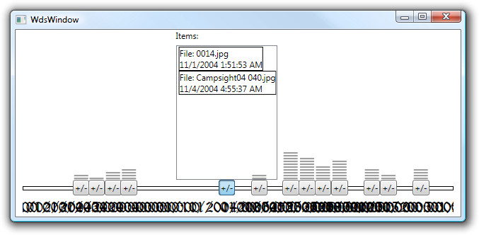
Clearly we have a bit of a problem with the captions on the timeline here, but you can see how this gives an impression of which bits of the timeline have a lot of content, and which bits are empty. Notice that in this example we also experimented with vertically stacked bars to indicate how much stuff was inside each group, to give a better idea of information density over time.
Now obviously this example looks horrible. Our goal at this stage was to try out some ideas to see if they would work before building something properly. As you’ll see in future blogs, it started looking a lot better once Felix got his hands on it.
Another feature we wanted was the ability to support multiple levels of detail—we envisaged the initial view as being a bunch of blobs on the timeline indicating files placed by date, which could be expanded to reveal details, possibly multiple levels of detail. So the examples above aggregate a bunch of files that appear in quick succession as a single blob, showing a list of all the files if you click on that blob, but we might want to go further, with some sort of details fly-out available on each of the items in that list.
We also wanted to avoid assuming much about the nature of the data source. We had discussed various ideas for what we might want to display along a timeline—I forget the complete list, but TV schedule information, appointment booking, gaming, and project management came up as possible application areas.
So our ‘spec’ was pretty vague (although I’ve had worse). We decided to start with the file system/search example, and see where it took us—more a voyage of exploration than a software project. Perhaps not the most efficient approach to software development, but if you’re building a UI component of a kind you’ve not attempted before, it’s not a bad idea to be at least a little chaotic—your first design is unlikely to be your best, so some space to experiment is useful.
But where to start? If you want a custom control to get the best out of WPF, it’s a good idea to try and align yourself with WPF’s philosophy. But what is that, exactly?
Composition is King
I’ve long thought that WPF’s single biggest benefit is its composition-based approach. Examine most of the built-in controls, and you’ll find that they do less work than you might think, deferring to other WPF components to get the job done. And these subordinate components are almost invariably multi-purpose—they show up in other WPF controls, and can be used where appropriate in your own custom controls.
Take the ListBox. Amongst the things it doesn’t know how to do are: size and position the list items; render list items; provide selection highlighting; provide its own appearance. For these tasks it defers to its items panel, its item template, its item containers, and its control template respectively, and you can plug in your own objects for any of these, to customize the control. Of these, only the item container type (ListBoxItem) is specific to the ListBox, and even that shares a lot in common with other list controls’ items containers.
A single monolithic black box of a control might be in keeping with long-standing traditions of the Windows 3rd party control market, but it’s not the WPF way.
Areas of Responsibility
The WPF way is for each area of responsibility to be owned by a separate type. This is not a new idea, of course, but it’s one that seems to be less well represented in the UI layer than elsewhere.
When developing new UI element types, we design them to be combined in the ways we need them to work, and with luck, it will be possible to combine them usefully in ways we did not first anticipate. In fact that second part often requires more than luck—types are rarely reusable in practice until you’ve tried to use them in multiple scenarios and have fixed the problems that made them less useful than you had hoped. We haven’t done that yet for these controls, so this is probably not yet the definitive design.
So, what are the areas of responsibility we think exist for our timeline UI? Here’s a breakdown, along with a suggestion of what kind of object might fit the bill:
- Generation of UI elements from a data source (
ItemsControl?) - Visual representation of the ‘line’ in the timeline control (
ControlTemplate?) - Control to provide panning/scrolling (
ScrollViewer?) - Positioning of UI elements along a line (
Panel?) - Generated element type to be positioned on the line (some sort of
ContentControlorExpander?) - Visual representation of an item on the line (
ControlTemplate?) - Expanded view of content of generated element (
DataTemplate?)
You’ll notice that we have borrowed shamelessly from the pattern established by WPF’s various items controls. We can produce a very similar-looking list for ListBox:
- Derives from
ItemsControl, enabling it to generate items from a data source - Being a control it has a
ControlTemplateto define its appearance - Relies on
ScrollViewerto provide a scrollable area - Uses a
VirtualizingStackPanelto position its elements vertically - Generates a
ListBoxItem(which is aContentControl) for each item in the list ListBoxItemis a control, so it also has a templateItemTemplateor implicit data template used to render items in the list
If WPF already has a pattern that meets your needs, it’s usually a good idea to follow suit. Anyone already familiar with WPF will find your code easier to follow, and it also means you’re on a path likely to lead somewhere useful. But the degree of similarity here raises an obvious question: could we get away without creating any custom elements at all?
No Custom Elements?
It’s surprisingly common for WPF applications to be able to cobble together various WPF elements to achieve effects that would have required a custom control in Windows Forms. Could we do that here?
As an early experiment we built an application that queried Windows Search for all the bitmaps on a system, used LINQ to group them by month, and dumped the results into an ItemsControl to produce a timeline. To keep it simple we just used a StackPanel to get the items in order, but not yet positioned precisely according to date. The ItemTemplate contained a list of the files, using an Image element to render the actual image file. This list was initially collapsed, but could be expanded by clicking a button.
It rapidly became obvious that this wasn’t going to fly from a performance perspective. Even with the image lists initially collapsed, mere invisibility wasn’t enough to prevent the Image elements from being created. This meant that when the application started, it would attempt to load every single bitmap found by Windows Search. We let it run for a while to enjoy the spectacle of a single process consuming over 4GB of memory—it’s entertaining to pretend you have a justification for owning a 64-bit system—before giving up and killing it off.
The naive approach clearly wasn’t going to work, but we could make a small change to reduce the memory footprint: we decided to take the image loading out of WPF’s Image element’s hands. Instead of binding the Image element’s Source directly to the bitmap path, we wrote some code to load the image. This gave us the option to specify a size for the loaded image—since we were only showing thumbnails, we told WPF to decode the image to a much smaller size, just 40x30 pixels. This way it was at least conceivable that all the images we were trying to load might fit in memory. This ‘improved’ matters in the sense that the application progressed from not working at all to working unusably slowly.
It was starting to look like some form of virtualization might be necessary.
(This is of course all utterly predictable. Less subtle minds than your own might even conclude that we were idiots for bothering to try this naive approach. But I’ve learned that it’s wise to start your performance investigations with the parts you can predict. That way you get to find out which of your predictions were wrong. Plus, you might get to observe things going wrong in a slightly different fashion from the one you expected, which can offer useful insights. Indeed, besides the rather obvious expected memory consumption problems, we observed some CPU-bound performance issues in the image handling in some places that surprised us, and which uncovered an opportunity to significantly speed up our eventual load time performance which might have been harder to spot at a later stage. I’ll cover this in a later blog.)
A couple of options stood out for improving the bitmap handling. We could get slightly cleverer with the expansion of the per-group list: rather than merely collapsing the list until the user expanded it, we could arrange not to create the list at all until needed—that should avoid the premature (and rather expensive) loading of every bitmap on the system. Or we could use a virtualizing panel for the main timeline items control, so that the groups’ UIs didn’t get instantiated at all until they appeared on screen. We tried both.
Either of these on their own produced a profound improvement—the application went from “Fail slowly” to “Sub-second load” performance. However, using just one or the other wasn’t enough to get that “sub-second” quite “sub-” enough—we were seeing a half second UI freeze between the Windows Search results coming back and the results being displayed. Only with both techniques applied was the performance satisfactory.
So we need at least one custom element: our panel needs to virtualize, and the only built-in virtualizing panel is the VirtualizingStackPanel. That doesn’t give us the positioning we want: we need to be able to select a position based on some date. Only Canvas and Grid make that sort of control possible, and neither of those can virtualize. So we need our own panel. We provisionally chose to call this a VirtualizingOffsetPanel, for want of a better name.
We also decided to build a custom control to perform the expansion. It is technically possible to get the deferred list realization needed with an Expander: the trick is to use a ContentTemplate rather than just making our image list the child of the Expander. However, we’d be relying on a side effect of an undocumented Expander behaviour. I’ve gone down a similar path before with tree view item expansion, and didn’t enjoy it. So we decided to make our own expander (which is a pretty simple thing to construct) in order to give us control over what actions occur and in which order when an item is expanded. And since this control was going to be instantiated for each item on the timeline, we decided to designate this as the item container for our timeline control. And since a custom item container requires a custom items control, we have a reason for a third custom element, the TimelineControl itself.
So it’s now looking like we’re going to write three custom elements: a TimelineControl, a TimelineGroupItem, and a VirtualizingOffsetPanel. Yes, for that second one, the name TimelineControlItem might have looked more consistent, but TimelineGroupItem felt like a more accurate description of what it represented. So far, it still feels that way, so we’re still calling it that.
Aside: To Group or Not to Group
If you’re familiar with the capabilities of WPF data binding, you might be thinking: hold on, why aren’t you using CollectionView.GroupDescriptions and a GroupStyle? Well we tried that, but it seems that grouping in ItemsControls has the side-effect of disabling virtualization. And since we need virtualization to get acceptable load performance, that’s a non-starter.
In any case, this didn’t seem like a great loss. After a fiddling around with Windows Search for a while, LINQ started to look like an easier and more flexible way to manage grouping.
Prototyping Matters
Trying to build a working example with no custom elements at all was an important exercise. We had outlined a rough design of what we thought we probably wanted before we started. This up-front design was by no means ‘big’, but we got something wrong nonetheless. We originally thought we’d want not just the timeline and group item controls, but also an individual timeline item control. But in working through the prototype, no clear need for such a control emerged—it seems that having established a need for the TimelineControl, TimelineGroupItem, and VirtualizingOffsetPanel items, a combination of content controls and data templates was enough to finish off the job.
In future blog entries I’ll talk about how we went about building each of these custom elements.