Filling ListView Columns in WPF
WPF’s ListView control left-aligns the content of columns by default. This can lead to slightly surprising results when you use a TextBox in one of the columns:

What’s happening here is that the TextBox is being sized to content. (That’s what happens if you left-align an element in WPF.) It gets worse if your text boxes are initially empty—they start out very thin. And as you type into them, they expand. It’s hard to imagine why anyone might want that behaviour, so you’ll probably want to change it.
A simple but somewhat unsatisfactory fix is to set the Width of the TextBox. This lets you provide a more sensible initial width. It also gets rid of the size-to-content behaviour, which good because you usually don’t want that on a TextBox. The problem with this is that a fixed-width TextBox will not resize when the user resizes the column by dragging the header. Wouldn’t it be better if the TextBox simply took its width from the column header? That way, you can set a sensible initial width, and then allow the user to make the text boxes wider by resizing the column.
To do this, we need to make sure the list column contents have a horizontal alignment of Stretch, which means ‘make this element the same width as its container’. Throughout most of WPF, Stretch is the default, so it’s a little surprising that the ListView doesn’t follow suit. In fact it uses Left, which is a little irritating—the problem described here simply wouldn’t occur if ListView hadn’t used the normal default. Fortunately, we can change it. (So far I’ve worked out how to do this twice, and then promptly forgotten again on both occasions. I’m putting it in a blog so that next time I’ll remember, or at least I’ll know where to look.)
The alignment of the column content is controlled by the ListViewItem container. There will be one of these for each row in the ListView, which will generate them automatically if you don’t supply your own. In fact if you’re using data binding, you don’t have the option to supply your own. And since putting a TextBox column into a ListView probably only makes sense in data binding scenarios, chances are you’ll be using generated ListViewItem containers.
So it’s not as simple as setting properties on the ListViewItem containers—those containers don’t appear anywhere in your XAML because they are generated implicitly by WPF.
As with any control that derives from ItemsControl, ListView lets you set properties on the generated item containers setting the ItemContainerStyle property. We can use this to modify the HorizontalContentAlignment of the ListViewItem containers:
<Grid>
  <Grid.Resources>
    <x:Array Type="{x:Type s:String}" x:Key="items">
      <s:String>Foo</s:String>
      <s:String>Bar</s:String>
      <s:String>Spong</s:String>
    </x:Array>
  </Grid.Resources>

  <ListView ItemsSource="{StaticResource items}">

    <ListView.ItemContainerStyle>
      <Style TargetType="ListViewItem">
        <Setter Property="HorizontalContentAlignment"
                Value="Stretch" />
      </Style>
    </ListView.ItemContainerStyle>

    <ListView.View>
      <GridView>
        <GridViewColumn Header="Data" Width="80">
          <GridViewColumn.CellTemplate>
            <DataTemplate>
              <TextBox Text="{Binding .}"  />
            </DataTemplate>
          </GridViewColumn.CellTemplate>
        </GridViewColumn>
        <GridViewColumn Header="Length"
             DisplayMemberBinding="{Binding Length}" />
      </GridView>
    </ListView.View>
  </ListView>

</Grid>
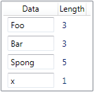
As you can see, each TextBox now fills the column:

These text boxes will now resize when the user resizes the column header.
(Note: this particular example isn’t terribly useful, because it binds directly to an array of strings. Strings are immutable, so editing the string causes WPF to generate a new string. Because arrays don’t generate change notifications, the Length column fails to update. In practice, you’d bind to properties of some object designed to be edited, so you wouldn’t see this problem. I’ve over-simplified the data binding here so as not to obscure the main point.)
The ListViewItem actually copies its horizontal alignment down to each individual column. This means there’s no way to control the alignment for individual columns. In fact that’s not really a problem, because if you set it to Stretch for everything, it’s easy enough to set a different alignment on the child content specified in the CellTemplate. Indeed, this is what makes the default choice of Left alignment so odd here: given a column alignment of Stretch, you can use Left, Right or Center in each column template as you see fit. Moreover, a TextBlock does the right thing without even trying: a TextBlock set to Stretch will align the text according to its TextAlignment property, so even though the TextBlock may nominally fill the entire column width, it’ll still look like it’s left aligned by default because the alignment of the text inside the TextBlock can be managed independently of the alignment of the TextBlock itself. So there really does seem to be no good reason for this default left-aligned setting imposed by the ListView—with that in play, you can’t do anything other than left-align the contents of the column. But once you’ve fixed that with the style shown above, everything works as you’d hope.
Note that while fixing the content alignment to Stretch gives you full control over each column’s alignment, you’ll still be left with some white space on either side of each column. The ListView adds a horizontal margin of 6 device independent pixels on either side of each column. This turns out to be much harder to remove. I’ll show how to do that in a future blog.