Creating Office-Style Textual Separators in WPF with Grouped Menus
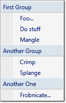
I've recently been catching up on Jensen Harris's Office UI blog. Earlier this year he talked about one of the new features of the Office 12 UI: textual menu separators. These allow menus to be split into sections, but instead of just using a horizontal line, each section has a title.
I thought I'd take a crack at doing the same in WPF. It turns out to be easy,
because WPF does all the work for you. The ItemsControl
class provides support for grouping items, with a header for each group.
(Beatriz Costa provides a great explanation
of WPF's
intrinsic grouped binding support here.) And since MenuItem
derives from ItemsControl you can use this feature in any databound menu.
Here's what it looks like:

I did this by binding the menu to a data source via the CollectionViewSource
type. (I don't know of a way to use grouping without data binding.) Let's take a look
at the code, one piece at a time. This example runs on the February CTP of WinFX:
<Page xmlns="http://schemas.microsoft.com/winfx/2006/xaml/presentation"
      xmlns:x="http://schemas.microsoft.com/winfx/2006/xaml">

  <Page.Resources>
    <XmlDataProvider x:Key="menuData">
      <x:XData>
        <Items xmlns="">
          <Item Title="Foo..." GroupName="First Group" />
          <Item Title="Do stuff" GroupName="First Group" />
          <Item Title="Mangle" GroupName="First Group" />
          <Item Title="Crimp" GroupName="Another Group" />
          <Item Title="Splange" GroupName="Another Group" />
          <Item Title="Frobnicate..." GroupName="Another One" />
        </Items>
      </x:XData>
    </XmlDataProvider>

    ...
That's just an XML data island. You probably wouldn't use this technique in a real application. But for this example we need a data source, so the simplest thing to do is add one inside the XAML. (Otherwise I'd have needed to introduce some codebehind, adding unnecessary and irrelevant complications.)
Next, we wrap this in a CollectionViewSource, providing
a PropertyGroupDescription indicating that we'd like to group by the
data's GroupName attribute:
    <CollectionViewSource x:Key="src"
        Source="{Binding Source={StaticResource menuData},
                         XPath=Items/Item}">
      <CollectionViewSource.GroupDescriptions>
        <PropertyGroupDescription PropertyName="@GroupName"/>
      </CollectionViewSource.GroupDescriptions>
    </CollectionViewSource>

  </Page.Resources>

  ...
Next, we define our menu. This Menu element is the top-level
menu bar; the interesting part is its one and only drop down menu, represented
as a MenuItem.
(The MenuItem type is potentially confusing, as it is used to represent
both submenus, and items in submenus. The same type is used for both kinds of item
because menus can be arranged in a hierarchy. Consider a sub-submenu: it is both a
menu in its own right, and also an item in another menu. You might like to think of it
as an example of the composite pattern.)
  <Menu VerticalAlignment="Top">
    <MenuItem Header="MyMenu"
              ItemsSource="{Binding Source={StaticResource src}}">

      ...
Note that this drop down menu is bound to the CollectionViewSource
we defined earlier. This determines the contents of the menu. We need to tell
WPF how we would like it to map the items in this data source onto properties
of the individual MenuItem objects that make up each entry in
drop down MenuItem. (WPF will generate a child 'item container' object
for each item of source data. Each class that derives from ItemsControl
uses its own item container type. In the case of a MenuItem, these
item containers are also MenuItem objects.) We define this mapping
by supplying a Style, for the item containers:
      <MenuItem.ItemContainerStyle>
        <Style TargetType="{x:Type MenuItem}">
          <Setter Property="Header"
                  Value="{Binding XPath=@Title}" />
        </Style>
      </MenuItem.ItemContainerStyle>
Finally, we need to tell WPF how we'd like it to display each of the group
headings. We do this by supplying a GroupStyle object, using its
HeaderTemplate property to define the appearance:
      <MenuItem.GroupStyle>
        <GroupStyle>
          <GroupStyle.HeaderTemplate>
            <DataTemplate>
              <Grid Background="#d9e4ec">
                <TextBlock Text="{Binding Name}" Margin="4" />
                <Rectangle Stroke="{x:Static SystemColors.MenuBrush}"
                           VerticalAlignment="Top" Height="1" />
                <Rectangle Stroke="#bbb" VerticalAlignment="Bottom"
                           Height="1" />
              </Grid>
            </DataTemplate>
          </GroupStyle.HeaderTemplate>
        </GroupStyle>
      </MenuItem.GroupStyle>
    </MenuItem>
  </Menu>

</Page>
You might be wondering what the Name property in the TextBlock's
binding expression refers to. We've not defined any such property anywhere in this
example. It turns out that the implicit binding context for the
GroupStyle.HeaderTemplate is an object of type CollectionViewGroup.
WPF creates one of these for each group in the source data.
And that's it. As Beatriz's original article shows, this isn't limited to menus -
anything that derives from ItemsControl can present grouped data. Indeed,
I've not really added a great deal beyond that article. I just thought it would be
interesting to show the technique in the context of this specific example.